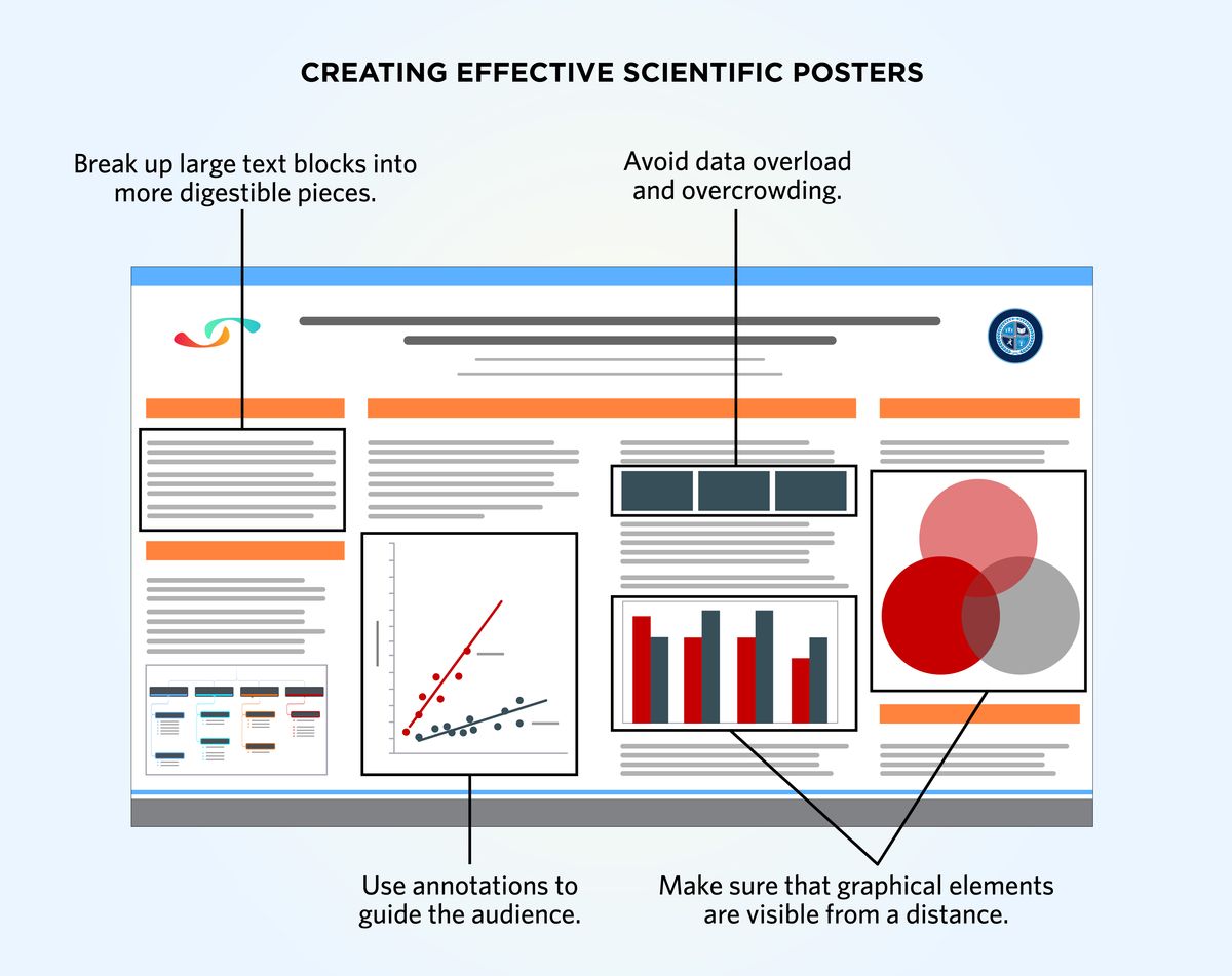
Posters are a staple of scientific communication, and most trainees will make at least one poster during their time in graduate school. However, despite posters being the second-most popular means of disseminating research findings, formal training tends to be scarcely available. As a result, most scientists look at existing posters—whether something that a labmate had previously made or one that they saw at a conference—for inspiration. Perhaps because of this, poster quality tends to vary dramatically, running the gamut from the professional to the unintelligible. A poster needs to incorporate principles of scientific communication and graphic design in order to be effective.
Posters Are Not Big Slides
The poster serves as a visual summary of a research project and, therefore, shares similarities with both slide decks and manuscript figures when it comes to theme and purpose. However, trainees make a major mistake when they convert slide decks and figures into posters verbatim, without changing the content to fit the new medium. While posters should maintain the succinctness of a slide deck, slide decks are meant to be consumed alongside a presenter. Posters must be understandable even without someone to guide the audience through the content. Similarly, manuscript figures are typically very detailed because the reader has ample time to carefully parse each feature and panel. However, posters are not typically viewed under circumstances where such meticulous review is feasible.
As such, while bringing content from slide decks and manuscript figures into posters is generally a good practice, they must be amended. Here, scientists should strike a fine balance between brevity and detail, finding a sweet spot where the poster is able to tell its story in a digestible manner. The goal for every poster is to convey the depth and significance of the study without showcasing too much detail or complexity that would impede accessibility.
Applying Design Principles to Posters
At their core, the poster is a visual medium, meaning that figures and graphics are their most important components. A poster figure differs from a manuscript figure in several ways—the main one being that poster figures have to be both legible and striking from a distance. Poster figures, including their individual components such as panels and labels, should be large enough so that someone standing several feet away is still able to discern the intended main message. Poster figures should not be overly complicated, cluttered, or include too much information.

Before sitting down to make their figures, scientists should first identify key pieces of information that they want to present visually. For example, if a one-hour time course experiment shows no reaction until minute 40, the figure could potentially depict a line graph for the whole time course but only representative images for the baseline and for the 40 minute time point. Similarly, a bar graph featuring six experimental groups but only showing a response in a single group could elect to only show a representative image for that singular group for the purpose of visual simplicity. In this way, the presenter is showing the audience that they have performed their due diligence without distracting from the main finding. This approach also works for supporting information, which can be mentioned in short text captions or simply be left to be explained in person. Annotations are worth their weight in gold, and can guide the audience through a figure subtlety and unobtrusively.
Bringing Narrative to Posters
Ultimately, like with any communication medium, storytelling is key. For posters, this means applying good design practices to figures and the text as well. Avoid lengthy paragraphs—resist the temptation to just copy and paste the abstract into the top left corner. Instead, break up text blocks into key points. In this case, using a bullet point format may be too succinct and tends to not make full use of the canvas space. Instead, single sentences may serve as a good compromise.
Another good strategy is to use graphics as alternatives to large text blocks. For example, create schematic diagrams to explain the methodology. Depending on how the overall project is designed, this can either be in the form of a single large figure such as a flowchart or multiple small figures showcasing individual protocols. These protocol panels can even accompany the data produced using the respective protocols. Finally, remember again that posters are first seen and interpreted from afar. Use bright colors and larger font sizes to make your poster stand out.
Standing Out In a Crowd
For manuscripts and presentations, the audience’s focus is directed on only a single presenter. That is usually not the case for posters, where presenters typically have to compete with dozens or even hundreds of others for attention. A poster may only receive a few seconds of attention as someone walks through a conference hall, making it all the more important for it to standout both visually and scientifically.
Looking for more information on scientific writing? Check out The Scientist’s TS SciComm section. Looking for some help putting together a manuscript, a figure, a poster, or anything else? The Scientist’s Scientific Services may have the professional help that you need.
